A maxed-out color on a Canadian smoke map doesn't mean the air outside has hit its worst. It means the scale ran out of room. That one misunderstanding cost me two summers of bad calls about when to open the windows, and it's the first thing I'd fix for anyone opening one of these maps today.
The tools worth your time are FireSmoke Canada for near-term smoke forecasts, the CWFIS interactive map for active fires, FireWork for smoke movement over the next three days, and the AirNow Fire and Smoke Map for ground readings near the border. Four maps, four different jobs. Mix them up and you'll seal the house on a day you didn't need to, or leave a window open on a day you really did.
TL;DR Quick Answers
Canada Wildfires Smoke Map
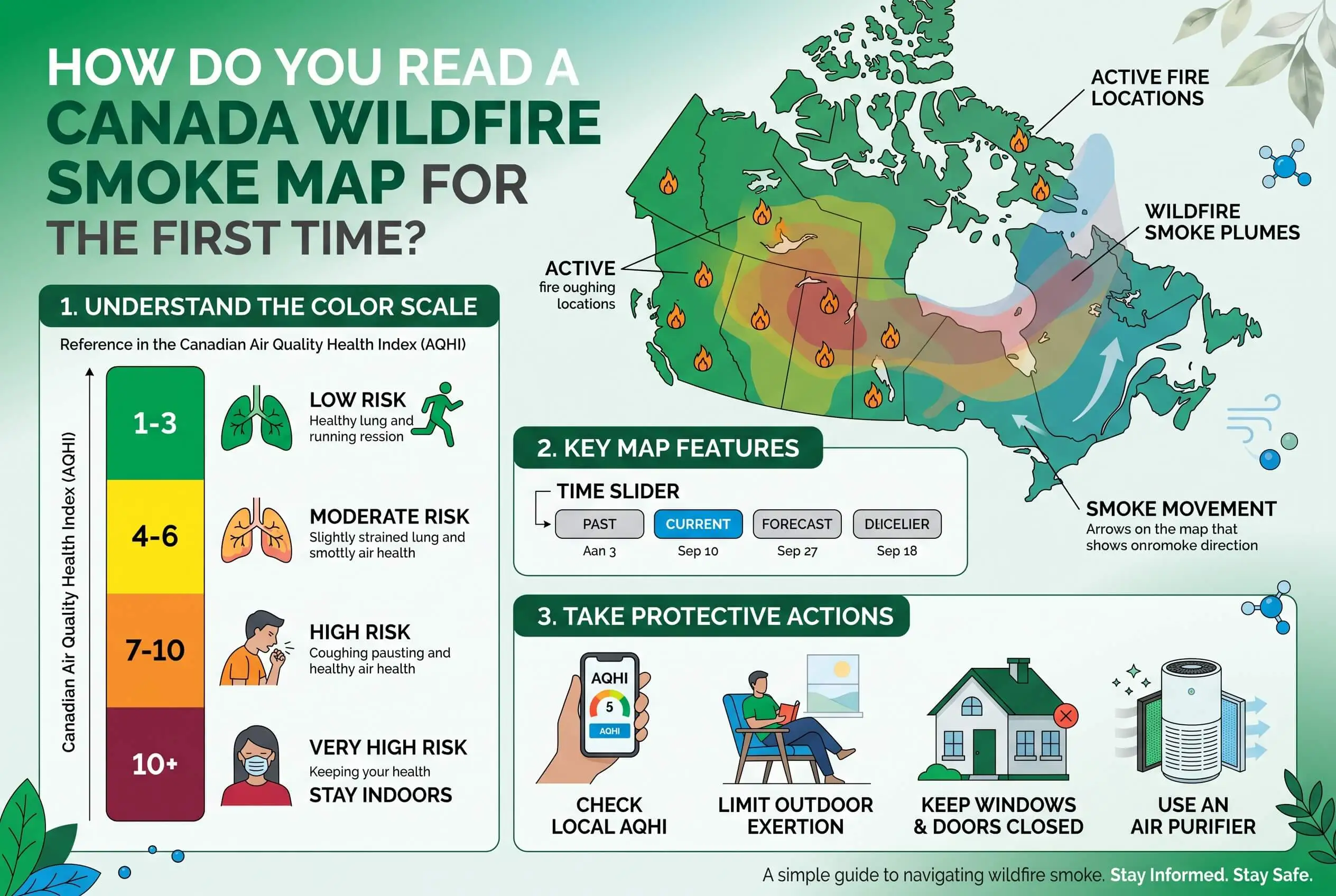
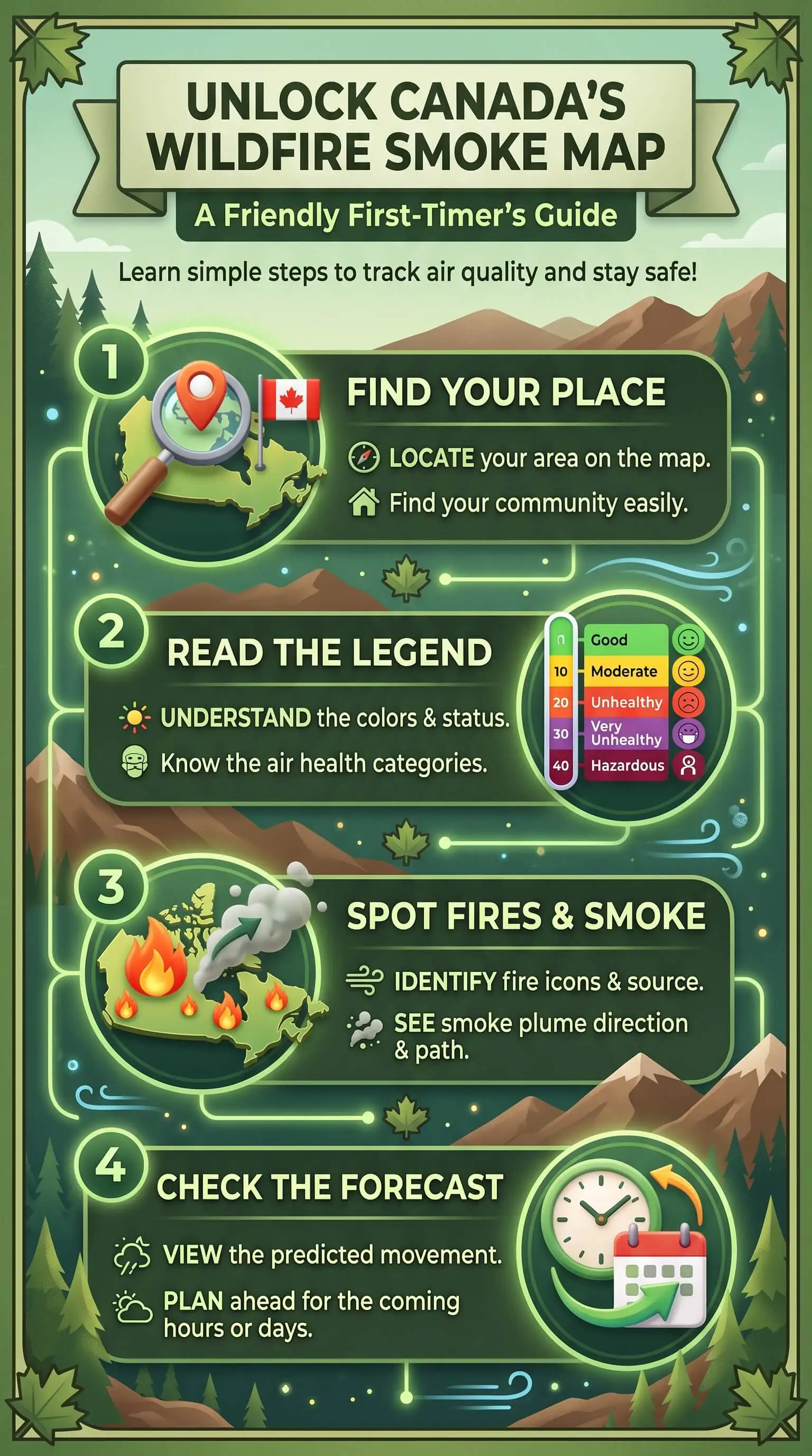
A Canada wildfires smoke map stacks three layers: satellite hotspots showing where fires burn, hand-traced outlines showing smoke in the sky, and ground monitors showing what you're actually breathing. Only the monitor layer answers the health question. A plume overhead doesn't mean smoke at street level.
Trust for right now: ground monitor readings, not plume shapes.
Plan with: FireSmoke Canada or FireWork, both forecast models running two to three days out.
10+ is a ceiling, not a peak: Canada's AQHI stops there while health risk keeps climbing.
Check twice a day: an afternoon wind shift redraws the picture within hours.
Act indoors: windows closed, fresh-air intake off, fan on continuous, highest filter rating your system handles without losing airflow.
Top Takeaways
Three layers, three meanings. Hotspots show fire, outlines show smoke in the sky, monitors show what reaches your lungs.
10+ is a ceiling, not a maximum. Risk keeps climbing after the number and the color both stop moving.
A forecast is not an observation. A model can miss a fire completely when cloud or smoke blocks the satellite's view of it.
Canadian and American scales don’t convert. The AQHI runs 1 to 10+ and the AQI runs 0 to 500, so one air mass gives you two unrelated readings.
Read it twice a day. Afternoon convection and a wind shift can redraw the whole picture in a few hours.
Start With the Three Layers Every Canada Wildfires Smoke Map Shows
Almost every mistake I made early on came from reading these maps as a single picture. They aren't one. Three separate measurements sit stacked on top of each other, and each one answers a question the other two can't.
What fire detections tell you, and what they don't
Satellites pick up heat signatures and flag them as hotspots. Natural Resources Canada feeds those detections into the CWFIS, which builds daily national fire maps off weather data from more than 2,500 stations across Canada and the United States. A hotspot means a fire exists in that spot. That's the whole message. It says nothing about smoke, and nothing yet about you.
Why a plume drawn over your town isn't proof you're breathing it
Those gray outlines come from NOAA's Hazard Mapping System, where analysts study satellite imagery, trace the visible edge of the smoke by hand, and label each shape light, medium, or heavy. The label describes thickness seen from above. Smoke can ride high in the atmosphere and cross an entire city without ever mixing down to street level, which is exactly why a shape on the map isn't evidence of anything in your lungs.
The one layer that's actually about your air
Ground monitors measure fine particles where you're standing, and this is the layer that answers the real question. You'll also find crowdsourced sensor readings on the AirNow map, drawn with different icons than the regulatory monitors, and those carry more uncertainty. When a monitor and a plume outline disagree, believe the monitor.
Once you can tell the layers apart, a map that carries fire and smoke together stops being noise and starts being useful. When I want all of it in one view instead of four browser tabs, I start with a live Canada wildfire and smoke map, then go check the monitor layer on its own.
Reading the Colors Without Misreading Them
Canada runs 1 to 10+, and 10+ is a ceiling
Canada reports air quality on the Air Quality Health Index, a 1 to 10+ scale sorted into four risk bands. Environment and Climate Change Canada states it plainly: once the index hits 10+, pollution and health risk can keep climbing while the reported number sits perfectly still. A steady 10+ isn't a steady situation. It's a gauge that's pegged, and for two seasons I read it as the worst it gets.
Two other things shift during a smoke event, and both change what the number means. The index normally blends fine particles, ground-level ozone, and nitrogen dioxide. When smoke moves in, fine particles can swamp the other two, so the index gets recalculated hourly on particles alone. British Columbia went further and built an adjusted version called AQHI-Plus after finding the standard index sometimes under-reported health risk on smoky days. When a government corrects its own index, pay attention.
Why the same air reads differently on a US map
Canada uses the 1 to 10+ AQHI. The United States uses the AQI, which runs from 0 to 500. Different math, and no conversion between them. Live near the border, flip between a Canadian and an American map, and one air mass will hand you two numbers that don't relate to each other. Pick the index your local health authority uses and stay with it. It helps to remember that Canada is the second-largest country on earth by total area, so a single national map spans several unrelated weather systems and won't survive a glance.
Forecast Maps and Live Maps Answer Different Questions
FireSmoke Canada and FireWork are models. They take fire locations and forecast weather, then project where smoke should travel, out to two days and three days respectively. The AirNow monitor layer measures instead of projecting. It reports what instruments actually recorded.
That difference explains the complaint I hear most often, which is smelling smoke while the map shows clear air. Fire detection depends on a satellite seeing heat, and cloud cover or thick smoke sitting over a burning area will hide it, so those emissions never enter the model and the forecast never draws that plume. FireSmoke Canada labels its own experimental output for this exact reason. Read a pale patch as missing data rather than missing smoke.
Check the Map Again in the Afternoon
A morning reading isn't a plan for the day. Convection builds through the afternoon, gap winds funnel smoke down the valleys in British Columbia and the Yukon, and a front crossing the Prairies can shove a plume a long way in a few hours. I look twice, once before committing to anything outdoors and once mid-afternoon, then factor in indoor protection such as FPR in air filters if smoke conditions worsen. Twice has caught changes that once would have missed.
What the Map Should Change Indoors
A reading only earns its keep if it changes something in your house. When the number climbs, close the windows and doors, shut the fresh-air intake so your system stops pulling smoke inside, and set the fan to run continuously so indoor air keeps passing the filter instead of moving only when the system heats or cools. Run the highest-rated filter your system handles without losing airflow. Then pick one room and keep that one cleanest.
The EPA reports that indoor fine-particle levels typically sit around 55 to 60 percent of outdoor levels during a smoke event. Sealing up helps. It won't get you to clean air on its own, and indoor air quality testing can help you understand what pollutants remain. That remaining gap is exactly where your filter does the work.
“The gap I watch for is a heavy plume outline sitting right on top of a monitor that's still reading low. In my experience that almost always means the smoke is aloft and hasn't mixed down yet, and it means I've got a few hours to get the windows shut and a fresh filter in before it does.”
7 Essential Resources
1. See which fires are burning right now, nationwide
The daily national fire picture, built from satellite hotspots and thousands of weather stations. Start here to learn whether there's a source anywhere upwind of you. Source: CWFIS Interactive Map, Natural Resources Canada.
2. Get a two-day read on where the smoke is headed
The BlueSky Canada forecast models ground-level fine particles from wildfire smoke across the country. Treat it as guidance and read its own caveats about how satellites find fires. Source: FireSmoke Canada, University of British Columbia.
3. Track smoke movement across North America for 72 hours
Environment and Climate Change Canada's forecast maps show how a plume should evolve and move over three days, with hourly, daily average, and daily maximum views. Source: FireWork, Environment and Climate Change Canada.
4. Turn a color into an actual health instruction
The index itself, with all four risk bands and the specific health messages attached to each one, split between at-risk and general populations. Source: Air Quality Health Index, Environment and Climate Change Canada.
5. Understand why the index behaves differently in smoke
The official word on the particle-only recalculation during smoke events and what a 10+ reading does and doesn't mean. This is the page that corrected my own misreading. Source: Wildfire smoke, air quality and your health, Government of Canada.
6. Cross-check the border with dense monitor coverage
South of the border the monitor network is dense, which helps when Canadian smoke crosses into the United States and you want a ground reading instead of a modelled one. Source: AirNow Fire and Smoke Map, EPA and US Forest Service.
7. Know who draws the plumes you’re looking at
The plume outlines on nearly every North American smoke map trace back to this one analyst-run program. Knowing how it assigns the light, medium, and heavy classes changes how much weight you give them. Source: Hazard Mapping System Fire and Smoke Product, NOAA NESDIS.
The best way to protect yourself is to keep smoke outdoors, while using trusted wildfire, smoke forecast, and air quality resources to track changing conditions and know when extra precautions are needed.
3 Statistics
Indoor air runs roughly 55 to 60 percent of outdoor particle levels during a smoke event. Closing up the house is a partial fix. Source: EPA.
British Columbia built a second version of the index just for smoke. AQHI-Plus arrived after the standard index turned out to under-report health risk on smoky days. Source: Province of British Columbia.
More than 2,500 weather stations feed the Canadian fire maps. Those stations span Canada and the United States and drive the daily fire weather and fire behaviour picture. Source: Natural Resources Canada.
These statistics show why tracking wildfire smoke and indoor particle levels matters, while using top air filters can help reduce the particles that still enter your home during smoke events.
Final Thoughts and Opinion
My position, after several smoke seasons with these tools, is that the color scale is the most dangerous element on the screen. Every other layer stays honest about being an estimate. Analysts trace the plumes by hand, forecast pages say experimental right there in the text, and hotspot data ships with resolution caveats attached. The color band is the only element that looks definitive, and it's the one carrying a hard stop.
That's why I quit treating these maps as a scoreboard. A number isn't a verdict on your day. It's a prompt to look at the nearest ground monitor and then change something about the air inside your house, including whether standalone air purifiers could help improve indoor air quality. If your map only ever tells you how bad it is out there, you're using half of it.
Frequently Asked Questions
Why is there no smoke on the map when I can smell it?
Fire detection relies on satellites spotting heat, and cloud cover or dense smoke over the fire can hide it, so those emissions never reach the forecast model and no plume gets drawn. Trust your nose and the nearest ground monitor over a forecast that looks clear.
Does Canadian wildfire smoke really reach the United States?
Routinely. Smoke travels thousands of kilometres from the fire zone, which is why air quality degrades in parts of the US during Canadian fire seasons with no fire anywhere nearby. That's the whole reason a Canadian map earns your attention even if you live well south of the border.
What does AQHI 10+ actually mean?
Very high health risk, and during smoke it almost always means very high fine particle levels. It also means the scale has run out of room, so conditions can worsen past that point without the number budging.
Which map should I check first?
For a decision you're making today, a ground monitor reading. For planning tomorrow, a forecast layer. For working out whether a smoke episode will drag on, the fire map, because a large active fire upwind means the source isn't going anywhere.
Are the crowdsourced sensor readings reliable?
They're useful, especially where no regulatory monitor sits nearby, and they pass through quality control and a correction before they appear on the AirNow map. They still aren't regulatory-grade instruments, so treat them as supporting evidence rather than the final word.
How often should I change filters during a smoke season?
More often than the box suggests. Inspect pleated furnace filters every one to two weeks through a sustained smoke episode, and replace early if the media looks gray or matted or airflow at the vents drops off. Smoke loads a filter far faster than ordinary household dust.
Read the Map, Then Change Something Indoors
You've got what you need to open a Canada wildfires smoke map and read it layer by layer instead of all at once. Take your next reading and turn it into one concrete change inside the house, starting with the filter your system is running today and considering options such as HVAC ionizer installation to support your indoor air quality strategy.
